

Propel Onboarding
Role: Senior Product Designer @ Propel
Team: 2 Engineers, 1 PM
Timeline: April–July 2024
background
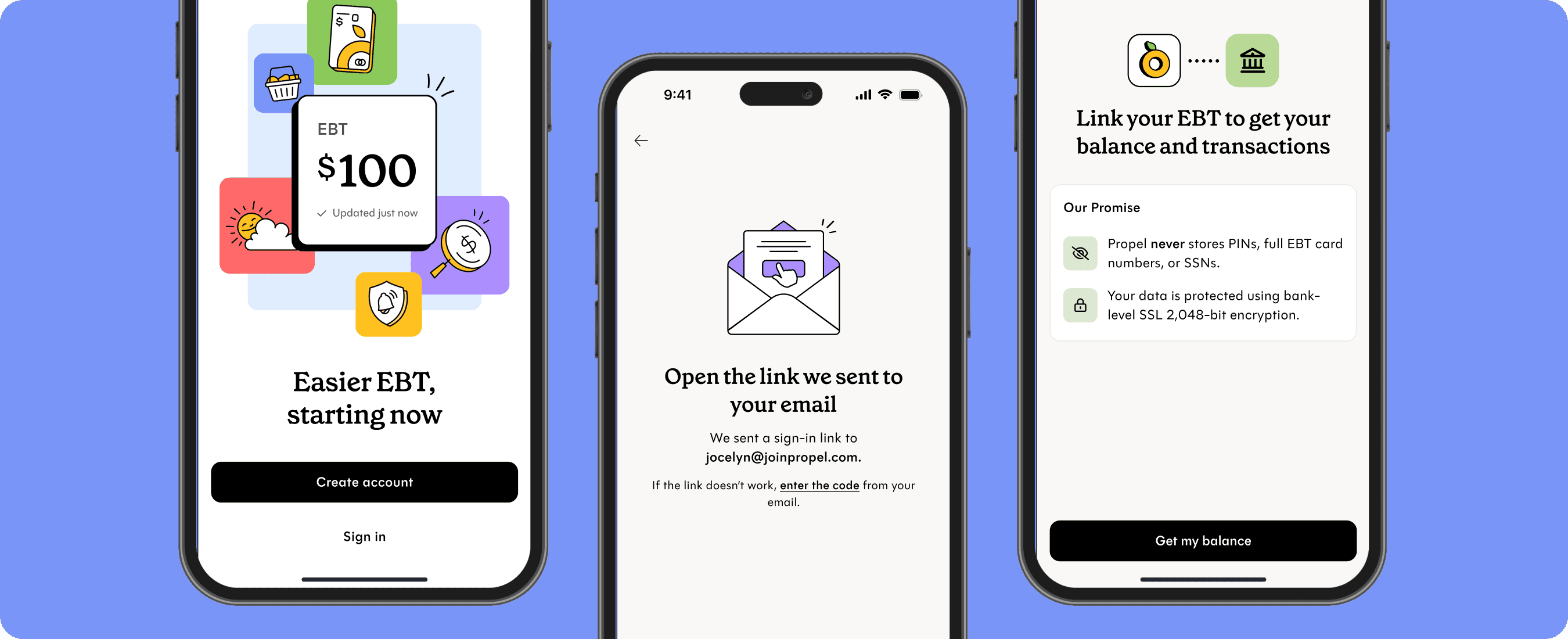
Over 15 million people have downloaded the Propel app (formerly Providers) for one main reason – to easily check their EBT balance. Our current onboarding experience was dated for several years, had too many optional steps, and blurred the lines between a government app and Propel’s brand.
Through multiple experiments throughout Q2 2024, my team and I revitalized the onboarding experience with less steps to activation and a clearer value proposition (without the extra fluff). This work also helped set the foundation for our rebrand and app name change in August 2024.
objectives
Build a seamless setup experience to get more users to the aha moment: linking their EBT to check their balance (aka “sync success”)
Reduce user friction where unnecessary
Unify our brand through-line and messaging, from product marketing to app download to activation
Key screens, before and after
Welcome screen A/B experiment
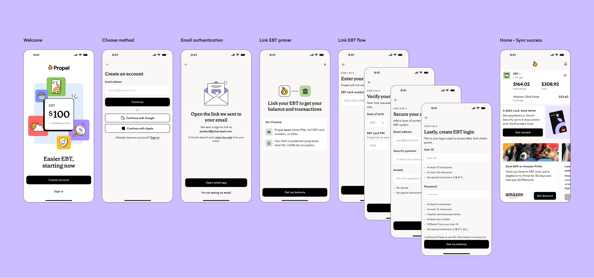
Full onboarding funnel
outcomes
In aggregate, our experiment changes increased our onboarding funnel from app open → sync success by an absolute 1.6%.
Through 20+ experiments and iteration, we shipped a welcoming onboarding flow and simplified experience that achieves the job that users come to us for – their realtime EBT balance at their fingertips, less shame at the checkout counter, and more certainty knowing exactly what’s in their wallets.
request access to learn more ✿
Wanna go deeper on these learnings or specific experiments? Let's connect!
Role: Senior Product Designer @ Propel
Team: 2 Engineers, 1 PM
Timeline: April–July 2024
background
Over 15 million people have downloaded the Propel app (formerly Providers) for one main reason – to easily check their EBT balance. Our current onboarding experience was dated for several years, had too many optional steps, and blurred the lines between a government app and Propel’s brand.
Through multiple experiments throughout Q2 2024, my team and I revitalized the onboarding experience with less steps to activation and a clearer value proposition (without the extra fluff). This work also helped set the foundation for our rebrand and app name change in August 2024.
objectives
Build a seamless setup experience to get more users to the aha moment: linking their EBT to check their balance (aka “sync success”)
Reduce user friction where unnecessary
Unify our brand through-line and messaging, from product marketing to app download to activation
Key screens, before and after
Welcome screen A/B experiment

Full onboarding funnel
outcomes
In aggregate, our experiment changes increased our onboarding funnel from app open → sync success by an absolute 1.6%.
Through 20+ experiments and iteration, we shipped a welcoming onboarding flow and simplified experience that achieves the job that users come to us for – their realtime EBT balance at their fingertips, less shame at the checkout counter, and more certainty knowing exactly what’s in their wallets.
request access to learn more ✿
Wanna go deeper on these learnings or specific experiments? Let's connect!
Role: Senior Product Designer @ Propel
Team: 2 Engineers, 1 PM
Timeline: April–July 2024
background
Over 15 million people have downloaded the Propel app (formerly Providers) for one main reason – to easily check their EBT balance. Our current onboarding experience was dated for several years, had too many optional steps, and blurred the lines between a government app and Propel’s brand.
Through multiple experiments throughout Q2 2024, my team and I revitalized the onboarding experience with less steps to activation and a clearer value proposition (without the extra fluff). This work also helped set the foundation for our rebrand and app name change in August 2024.
objectives
Build a seamless setup experience to get more users to the aha moment: linking their EBT to check their balance (aka “sync success”)
Reduce user friction where unnecessary
Unify our brand through-line and messaging, from product marketing to app download to activation
Key screens, before and after
Welcome screen A/B experiment

Full onboarding funnel
outcomes
In aggregate, our experiment changes increased our onboarding funnel from app open → sync success by an absolute 1.6%.
Through 20+ experiments and iteration, we shipped a welcoming onboarding flow and simplified experience that achieves the job that users come to us for – their realtime EBT balance at their fingertips, less shame at the checkout counter, and more certainty knowing exactly what’s in their wallets.
request access to learn more ✿
Wanna go deeper on these learnings or specific experiments? Let's connect!